Jose Abreu
Members
-
Joined
-
Last visited
Everything posted by Jose Abreu
-
-
-
-
Me too but I don't think Arizona lets Goldschmidt go away. Same with Arenado in Colorado.
-
I guess I may be displaying recency bias, because with the way this team has played, I've seen posters just giving up on the Machado dream on the basis that he wouldn't want to come here. All I know is that I trust us to at least be competitive with our offer. None of that 3 year max BS we saw with Cespedes.
-
That's funny, I see it the other way around. I think people believe we have virtually no chance, when I think we will at least be up there in terms of money offered
-
You could literally add Harper (let's say 40 mil) and Machado (30 mil) to next year's payroll, plus arbitration guys, and we likely would still be outside of the top 8 in payrolls. It definitely won't happen, but it speaks to the flexibility.
-
That's true. I really believe that we will be that team for Machado (he may not accept, but I think we'll offer him the most money).
-
Tim Anderson
-
Fulmer, Yoan, and Abreu deserve most of the praise, but that first inning was a team effort. 7 straight hits to start the game was really something.
-
Where is the little icon that tells you which # post each post is within the thread? Is that gone?
-
I'd be fine with either Yolmer or Tim there, with the other hitting 6th or 7th
-
To be fair there are guys like Gomez and Cedeno who are good but not on the 40 man
-
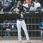
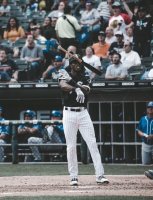
Abreu is so fun to watch at the plate. His swing is beautiful
-
In my opinion both Nicky and Matt are hitting too well for limited roles right now
-
By my count that's the 5th time this year Yoan has struck out looking on a pitch that was actually ball 4
-
-
Welcome! lol
-
I don't want Kopech to have to deal with all the misplays/errors though! ?
-
Yet people complain about us paying for half of Shields' contract
-
Is it bad that I still think a loss is a very real possibility tonight
-
Mr. Consistency himself
-
Yoan is hitting for the cycle today
-
It's like elementary school kickball. Engel is that one kid who never kicks it out of the infield. Except it's Major League Baseball, and that analogy isn't really that far-fetched
-
Everyone made hard contact except for Engel