JoeBatterz Posted March 16, 2006 Share Posted March 16, 2006 Good Old #3 turns 47 today. Quote Link to comment Share on other sites More sharing options...
Jordan4life_2007 Posted March 16, 2006 Share Posted March 16, 2006 Happy B-DAY to my 3rd favorite Sox player of all-time. Quote Link to comment Share on other sites More sharing options...
iWiN4PreP Posted March 16, 2006 Share Posted March 16, 2006 happy bday Quote Link to comment Share on other sites More sharing options...
SouthsideBlitz Posted March 16, 2006 Share Posted March 16, 2006 Quote Link to comment Share on other sites More sharing options...
SSH2005 Posted March 16, 2006 Share Posted March 16, 2006 Happy Birthday, HARRR... OOOLLLDDD!!! Quote Link to comment Share on other sites More sharing options...
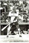
SouthsideBlitz Posted March 16, 2006 Share Posted March 16, 2006 ^^^ That my friend is probally one of the best pictures I have seen in a long long time. Quote Link to comment Share on other sites More sharing options...
G&T Posted March 16, 2006 Share Posted March 16, 2006 He was the first player I knew the name of way back when. I've got his autograph, which is awesome. Happy Birthday to him. Quote Link to comment Share on other sites More sharing options...
Baines3 Posted March 16, 2006 Share Posted March 16, 2006 Harold was my favorite White Sox player ever. Happy Birthday. Quote Link to comment Share on other sites More sharing options...
earthshiner Posted March 16, 2006 Share Posted March 16, 2006 I've been a fan of Harold since before I can remember. Quote Link to comment Share on other sites More sharing options...
wherehaveyougoneharold Posted March 16, 2006 Share Posted March 16, 2006 QUOTE(earthshiner @ Mar 16, 2006 -> 12:38 AM) I've been a fan of Harold since before I can remember. That's my man! Quote Link to comment Share on other sites More sharing options...
The Critic Posted March 16, 2006 Share Posted March 16, 2006 QUOTE(SSH2005 @ Mar 15, 2006 -> 09:44 PM) Happy Birthday, HARRR... OOOLLLDDD!!! The only pictures more rare than this one of Harold smiling are ones of the Loch Ness Monster or Bigfoot. You know, as much as I love the classic look of the current Sox uniforms, I do miss the uniform in this picture. I still have the old warmup jacket from this era, but it sure as hell don't fit me anymore.....too many pizzas under the bridge by now..... Quote Link to comment Share on other sites More sharing options...
sayitaintso Posted March 16, 2006 Share Posted March 16, 2006 Happy be-lated b-day to harold and me! Quote Link to comment Share on other sites More sharing options...
southsider2k5 Posted March 16, 2006 Share Posted March 16, 2006 QUOTE(The Critic @ Mar 16, 2006 -> 08:00 AM) The only pictures more rare than this one of Harold smiling are ones of the Loch Ness Monster or Bigfoot. You know, as much as I love the classic look of the current Sox uniforms, I do miss the uniform in this picture. I still have the old warmup jacket from this era, but it sure as hell don't fit me anymore.....too many pizzas under the bridge by now..... Wow, I thought I was the only one who liked this design? Then again I couldn't stand the 83 look (and still can't) so anything was an improvement. Quote Link to comment Share on other sites More sharing options...
greasywheels121 Posted March 16, 2006 Share Posted March 16, 2006 QUOTE(southsider2k5 @ Mar 16, 2006 -> 10:00 AM) Wow, I thought I was the only one who liked this design? Then again I couldn't stand the 83 look (and still can't) so anything was an improvement. Haha some reason I really like that jersey too. It does seem like it's really disliked among the majority of Sox fans though. With that being said, I hope we never change again. I think we've got a great look now, and it'd be nice to keep a permanent look like the Yankees. Quote Link to comment Share on other sites More sharing options...
The Critic Posted March 16, 2006 Share Posted March 16, 2006 QUOTE(southsider2k5 @ Mar 16, 2006 -> 09:00 AM) Wow, I thought I was the only one who liked this design? Then again I couldn't stand the 83 look (and still can't) so anything was an improvement. I didn't like the 83 "toothpaste tube" uniforms. The only thing I liked from that era was the road cap. It took a while for me to warm up to the Campbell's Soup "C" on the late 80's uniforms, but I thought they looked good. Quote Link to comment Share on other sites More sharing options...
WilliamTell Posted March 16, 2006 Share Posted March 16, 2006 Happy late birthday Harold. Quote Link to comment Share on other sites More sharing options...
TheBigHurt Posted March 16, 2006 Share Posted March 16, 2006 Happy Birthday Harold! Quote Link to comment Share on other sites More sharing options...
YASNY Posted March 17, 2006 Share Posted March 17, 2006 I never cared for any Sox uni that didn't have a diagonal "SOX" on the cap. Call me a traditionalist or whatever, but that's always been a team signature in my eyes. There is a uniqueness about it. Most teams have the initial(s) of the team location on the caps. Quote Link to comment Share on other sites More sharing options...
Recommended Posts
Join the conversation
You can post now and register later. If you have an account, sign in now to post with your account.