MiddleCoastBias
-
Posts
2,076 -
Joined
-
Last visited
Recent Profile Visitors


MiddleCoastBias's Achievements
")


-
Chicago White Sox's Offseason FA Signings Trades Megathread
MiddleCoastBias replied to caulfield12's topic in Pale Hose Talk
Don't worry, he's loading up a post to name at least 20+ current players we should target in FA or trades. -
Chicago White Sox's Offseason FA Signings Trades Megathread
MiddleCoastBias replied to caulfield12's topic in Pale Hose Talk
I get that in principle but I feel like that only works when it's a report about an interesting team. If even we don't believe it as delusional fans, what rational opposing team owner is going to feel threatened by this report? -
Agreed, I view this round of FA as an investment to earn a better perception around the league for when we actually need FAs to sign here in a couple of years. I'd rather get rid of that "ew, I don't want to sign there" stink on some B+ free agents so we aren't out of the running on the better FAs in the (hopefully) near future.
-
Savanah Bananas tonight at Sox Park
MiddleCoastBias replied to southsider2k5's topic in Pale Hose Talk
If I recall, the broadcast seemed like some random old baseball players that just needed a job haha -
Savanah Bananas tonight at Sox Park
MiddleCoastBias replied to southsider2k5's topic in Pale Hose Talk
Oh man, this reminds me of the Covid delay and waking up at 5am to watch the KBO to scratch the baseball itch. Saladino and Palka representing on Samsung, woop woop -
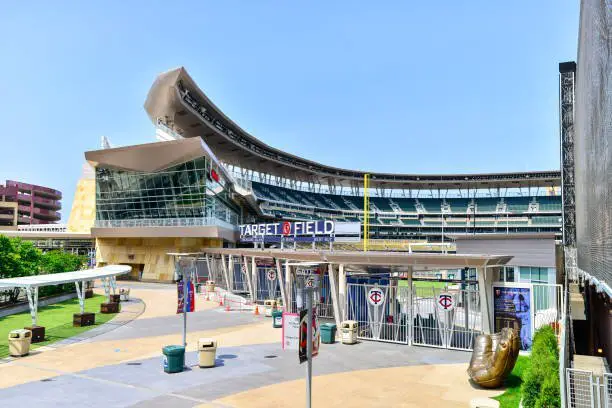
Minneapolis too. I was just there a couple of weeks ago for the Nats series. Overall pretty meh stadium (a little disappointed), but walking in from the street in the RF corner to an open concourse/plaza that leads down to the 1B-side seats was really nice.
-
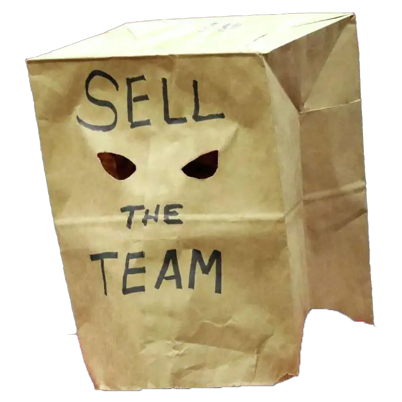
Would you be on board with a rebrand when Ishbia takes over?
MiddleCoastBias replied to ron883's topic in Pale Hose Talk
I was the one to suggest this yesterday and I agree with many of your points. My suggestion was to bring back the red piping around the current logo, akin to what they had back in the '50s. The logo is still effectively the same, the brand image is still the same, everything is still recognizably "The Sox"... just with a little added color and definition. I get people may still view that as change just for the sake of change, or throwing out a recognizable logo, but I contend that it changes *just enough* to mark a new era while still retaining the Sox brand and identity. -
I know this isn't the point of this thread but I'm going to bang the drum I've been beating for a couple of years - I think we see a soft rebrand when Ishbia takes over, and we need it. Blah blah iconic black and white logo, I get it and I agree. But I think we rebrand and add red to the logo like the '52. Keep everything else, just add red accents. Small/big thing but it'll signify we're making a big transition, hopefully from top to bottom as an organization.
-
Luis Robert trade thread: La Pantera stays.
MiddleCoastBias replied to ChiSoxFanMike's topic in Pale Hose Talk
Bonus upside to restructuring his deal and buying out those option years is that we can still trade him later and he'll no longer be viewed as a rental* (*assuming he continues to produce at the level that he can, and that he stays even remotely healthy) -
Luis Robert trade thread: La Pantera stays.
MiddleCoastBias replied to ChiSoxFanMike's topic in Pale Hose Talk
Ok so I was in the old camp with "but if we give Harp-chado $600M, we won't be able to afford contracts to fill out the roster to support them!" And a friend finally convinced me - it's not my money to spend, so who gives a s%*# what they spend it on. Just spend them money. It's not my job to be frugal with someone else's money to make the business case for them. I don't care if we 'miss' on the extension and Robert gets injured again/has a down second half/turns into a literal pumpkin. Our payroll next year is a fart in the wind. Take the risk and extend him if it means a CHANCE at a better return if he plays to the ability that we know he can play. If we extend him for $20M and he doesn't perform/get that return, I won't cry for Jerry. -
Luis Robert trade thread: La Pantera stays.
MiddleCoastBias replied to ChiSoxFanMike's topic in Pale Hose Talk
Sure things have drastically changed in Hahn vs. Getz. But Jerry is making the final decisions when it comes to contracts and handing out millions of dollars, and you can't convince me otherwise. -
Luis Robert trade thread: La Pantera stays.
MiddleCoastBias replied to ChiSoxFanMike's topic in Pale Hose Talk
I get what you're saying, but he also literally did this for a bad Craig Kimbrel just a couple of years ago. The better argument would be that he doesn't want to do this again if he can avoid it, but I still don't think I can say that with certainty. -
Luis Robert trade thread: La Pantera stays.
MiddleCoastBias replied to ChiSoxFanMike's topic in Pale Hose Talk
*cocks gun* Yet. -
Man, saw Teel get tripped by Luzardo and tumble awkwardly over and past first base. Thankfully he's ok. Flashbacks of Robert, Eloy, and Moncada - thought we were going to have another funeral in the dugout.
-
Contrary to any of my previous opinions, torpedo bats are actually good for baseball 😉